Andrew Laird, Mutual Ventures – The Government’s AI Opportunities Action Plan needs Cooperative Values
- January 2025
We use cookies to help you navigate efficiently and perform certain functions. You will find detailed information about all cookies under each consent category below.
The cookies that are categorized as "Necessary" are stored on your browser as they are essential for enabling the basic functionalities of the site. ...
Necessary cookies are required to enable the basic features of this site, such as providing secure log-in or adjusting your consent preferences. These cookies do not store any personally identifiable data.
Functional cookies help perform certain functionalities like sharing the content of the website on social media platforms, collecting feedback, and other third-party features.
Analytical cookies are used to understand how visitors interact with the website. These cookies help provide information on metrics such as the number of visitors, bounce rate, traffic source, etc.
Performance cookies are used to understand and analyze the key performance indexes of the website which helps in delivering a better user experience for the visitors.
Advertisement cookies are used to provide visitors with customized advertisements based on the pages you visited previously and to analyze the effectiveness of the ad campaigns.
1.2 million. That’s how many people we estimate are digitally excluded in Greater Manchester. That’s a lot.
About 42% of our 2.8 million population, all of whom we estimate are limited digital users or non-users. People who can’t access online health consultations. Children who can’t access education. Families who pay more for services when discounts are offered online. Jobseekers who can’t access new job opportunities.
And each person is different. Some people need assistive technology or devices to get online, others need an affordable connection. Some need basic skills, while others have the skills but not the confidence to use them. And some want to get online for their education or to get a job, while others – as shown by Age UK – don’t want to be online.
So, with every person needing something different – tech, a better broadband connection, work and skills support – it’s no surprise that digital exclusion is seen as everyone’s problem, and no-one’s responsibility.
But some places, organisations and partnerships are stepping up and taking responsibility. Places like Greater Manchester; organisations like the Good Things Foundation; partnerships like the Co-operative Councils Innovation Network. Public, private, and third sector organisations working together to tackle digital exclusion.
For me, information sits at the heart of tackling digital exclusion. I mean, of course, it would – I’m a researcher.
But if we are to tackle digital exclusion in Greater Manchester, if we want to get people online, and if we aim to connect those 1.2 million people to jobs, education, healthcare, opportunities – and even just family and friends – we need more information than we currently have.
The one big question we need to answer is: who exactly is digitally excluded?
That question is perhaps harder than it looks. You see, there isn’t a single, nationally consistent dataset that says, “This person is digitally excluded; this person is not”.
Some datasets give us contextual information. ONS, Ofcom, Lloyd’s Bank – they all provide information that tells us more about digitally excluded people. But not at the granularity we need to target activity at a local level.
Our 1.2 million estimate comes from work by Prof. Simeon Yates, the Good Things Foundation and others, looking at (regional) Ofcom survey results and segmenting digital service users. But who are they? Where do they live?
The constant refrain for us is “names, not numbers”.
In lieu of a good database – and we all love a good database – we need to find a way of targeting our activity better. If we can’t get names exactly, can we find out where they are likely to live?
That’s where risk indices come in. Risk indices look at likelihood. What are the factors that are associated with digital exclusion? Where are those factors prevalent in the local area?
Risk indices often work by assigning a score – usually on a common scale, say 0 to 10 – to an area dependent on the prevalence of a particular factor. To a (much more complicated) degree, this is what the Indices of Deprivation tend to do. The more prevalent a factor – or factors – associated with an issue, the higher the score, and the higher the risk of that issue being present.
There are some obvious downsides to this approach – the most notable one being that you are answering a much simpler question instead of a more difficult one. But there are some great upsides, including:
Many areas have experimented with and developed risk indices for digital exclusion – Salford, Manchester, Oldham, Westminster, West Midlands, and others locally and nationally. I’d strongly recommend chatting to the great people in these organisations whose role it is to understand local digital exclusion.
In Greater Manchester our partnerships all saw the great work being done locally on risk indices, and the value in expanding this work for the rest of Greater Manchester. So, my colleagues and I set out a plan to do just that.
We looked at the existing risk indices and chose to replicate Salford City Council’s work for the city region. But in reviewing different methodologies and indices, we noticed some striking similarities:
Furthermore, it was clear that different parts of the country – and indeed, different parts of Greater Manchester – were at different stages on their digital inclusion journey. It quickly became apparent that four things were needed:
That’s exactly what the Digital Exclusion Risk Index (DERI) set out to do: do something good, once, for everyone.
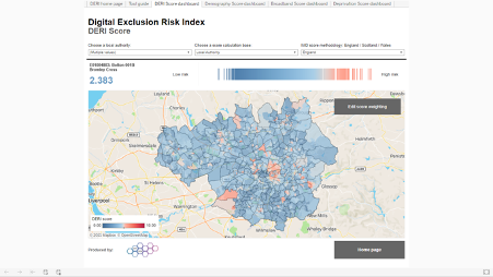
Put simply, the DERI is a dataset that shows where digital exclusion is most likely to occur. There is also a DERI tool we’ve created online, which is designed to allow you to explore that data.

It’s a composite index. It uses 12 different indicators, covering demography, deprivation and broadband access. We’ve normalised and weighted the indicators to create a score for every area in the country – a number between 0 (low risk of digital exclusion) and 10 (high risk).
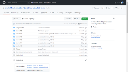
We’ve built it for every LSOA in England and Wales, and every data zone in Scotland. The dataset, the tool to explore the data, and the methodology are going to be made completely open – indeed, we’ve kept notes as we’ve gone along, updating them all here.

The tool is built in Tableau. It includes four dashboards to explore the DERI score and the three components, maps, charts, interactivity – the kind of stuff you expect from a dashboard.
And yes, we get the irony of building a tool about digital exclusion and publishing it online… One criticism is that the tool, which requires clicking on images and maps, is not amazingly accessible. We recognise that, which is why we’re making the data and calculations open too. But we’d be interested in your thoughts as to how to make our work even more accessible.
We were fortunate enough to work with the Co-operative Councils’ Innovation Network (CCIN) on building this tool. GMCA is a member of the CCIN, and its members are encouraged to suggest projects where they can work collaboratively with other members to find co-operative policy solutions to the challenges facing local government. We joined forces with a programme to tackle the digital divide, which was led by Cheshire West and Chester. We’d already established links with different parts of the country, and formed good partnerships in Greater Manchester, but the CCIN brought together a range of like-minded individuals who gave us some great feedback as we started to build it.
But it wasn’t all plain sailing. We figured out more about what people wanted from what they didn’t like. The data, for example, is mainly available at LSOA level. But most local authorities wanted to see their ward boundaries. So, we built and tested that approach.
And some areas wanted the flexibility to make certain datasets more important. So, we built and tested that too.
Sharing this with our partners around the country gave us valuable feedback and made us think about things we hadn’t considered before.
A great suggestion from colleagues in Glasgow – and one I suggest for others considering using deprivation data – is to us the composite deprivation index from mySociety. Again, the openness of this dataset and approach allowed us to create something that lets people from England, Wales, and Scotland to recalculate the DERI score based on their national deprivation index.
Openness and cooperation were the watchwords for this project.
Well, though we released the tool on October 22nd, we recognise this should continue to be developed – adding in new data, making changes as new information comes to the fore. And the previous versions are available for you to peruse, and to send us feedback.
But crucially we need to set out the best ways of using the DERI to support prioritisation of work; and the ways you shouldn’t use the DERI! After all, it is A tool in your toolbox for understanding digital exclusion, not THE tool.
The DERI has already given Greater Manchester a good idea of where to target our activities to have the biggest impact. And hopefully that will start to make a change for up to 1.2 million people in Greater Manchester – and beyond.
Christopher Pope
Principal, Research – Digital Analytics, Greater Manchester Combined Authority
T: 07973953770 Twitter: @MappingGM
E: christopher.pope@greatermanchester-ca.gov.uk
mapping@greatermanchester-ca.gov.uk
oda@greatermanchester-ca.gov.uk
This blog post was originally written for Good Things Foundation, and published on 22/10/2021. Minor amendments have been made to the blog before republishing here.